Mock Project: Amazon Prime Video Re-Design

Project Overview:
Re-design an area of the Amazon Prime website
The User Research Study suggested there were many existing usability and accessibility issues on the platform.
This project was completed by a team of five designers.
My role: research and design.
Problem Statement
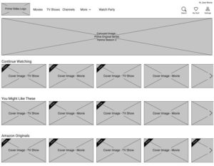
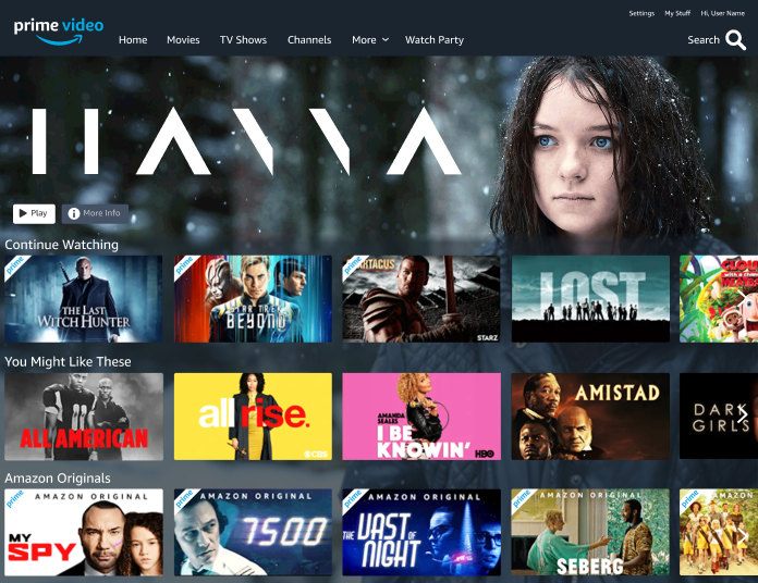
How can we minimize confusion and create better layout for Prime Video users, so they can easily access more relevant and organized search results in order to create a seamless and enjoyable viewing experience.
Solution
- Create a standalone website with an intuitive search function
- Give users an easy way filter content
- Give users an easy way to sort content
- Give users control to customize their search and filter results
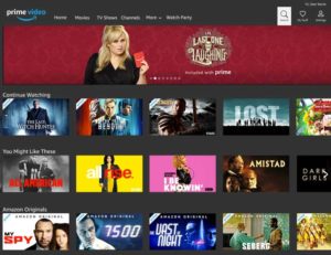
Heuristic Analysis Findings
- Search bar is not fixed on top of the screen, as you scroll down it disappears
- Categories are confusing and redundant
- Lack of control to refine results of recommended content
- Not enough white space for the mouse to rest on, triggering the autoplay of content
Research:
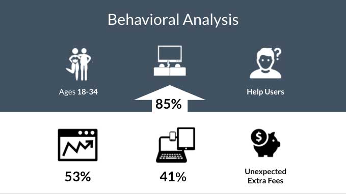
Behavioral Analysis and SWOT Analysis of Prime Video’s top competitors, Netflix, YouTube and Hulu.
2 surveys were conducted to gather crucial data from users.
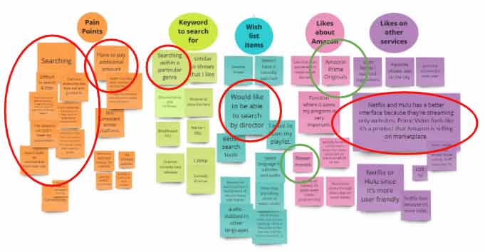
Research:
Affinity Map identifies Users Pain Points
Ideation: 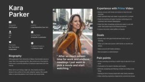
Ideation: Persona
Ideation:
User Journey: Kara Parker
Ideation: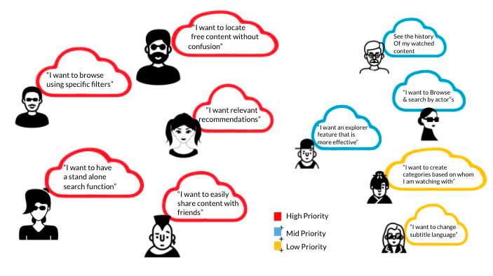
User Stories
Ideation:
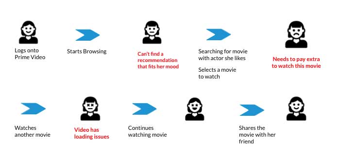
User Flow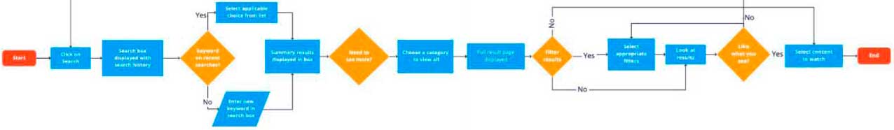
Ideation: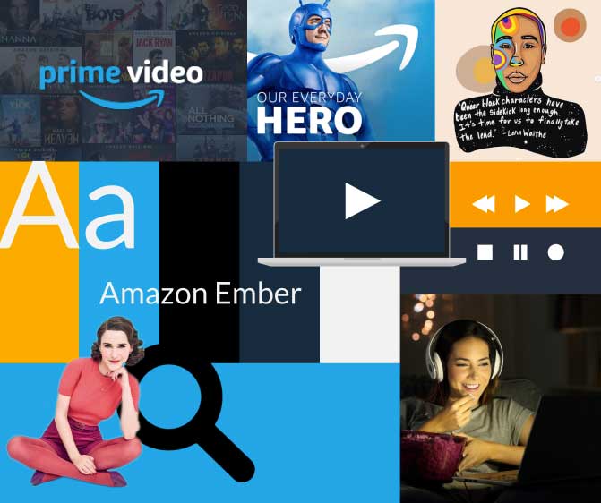
Mood Board